Branding
Greek Pasta with Global Ambition
A handcrafted pasta icon is growing globally. We gave a family business's artisan tradition a strong visual identity – proudly Greek, never generically Italian.
Kund
Mama Irene
Kategori
Food & Groceries
Leverans
Branding
Utmaning
Mama Irene's artisan pasta had already reached Michelin-starred restaurants and Galeries Lafayette. With a growing global expansion, the family business needed a visual identity that matched the new scale without losing its homemade character.
Målsättning
We aimed to create a brand that celebrates the family's craftsmanship tradition while positioning Mama Irene as a Greek—not Italian—pasta icon. The design needed to tell a unique story and be recognizable across all markets.
Resultat
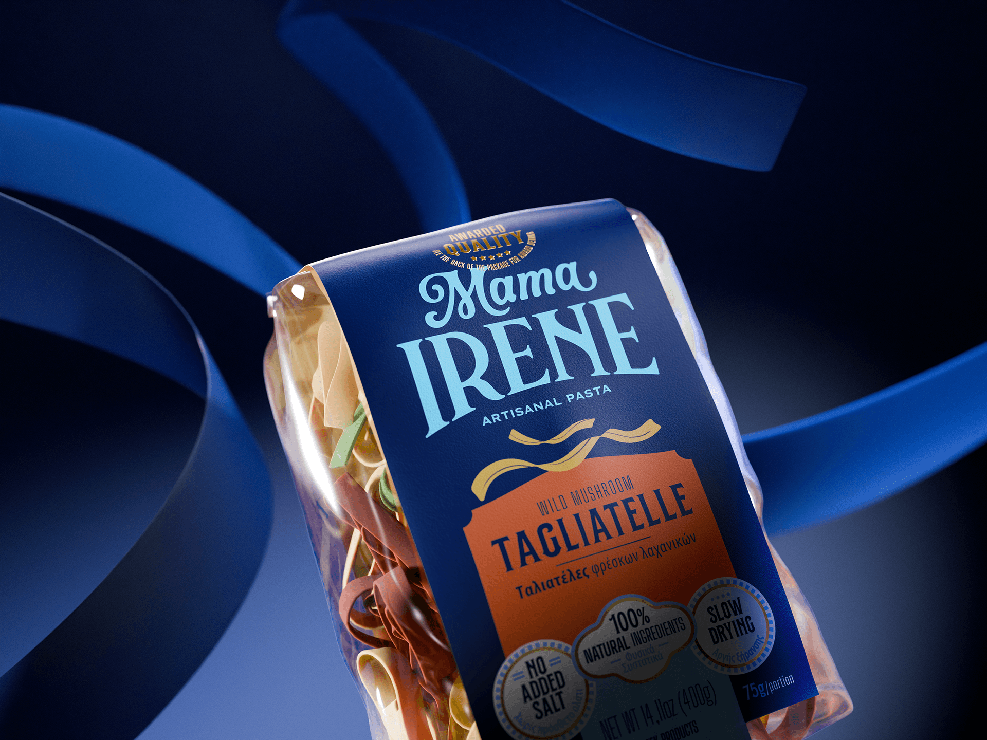
The new brand captures the handmade essence through an artistic illustration system. We created Mamaland – an imaginative world where fusilli becomes curly hair and orzo shapes trees. This playful approach, combined with a system of seals and labels for product information, creates something truly unique.


The brand and illustration system is the visual heart of Mama Irene. Each pasta type transforms into something alive – something that invites play and exploration. You can imagine sliding down tagliatelle or diving into a tomato sauce pool. This playful tone is entirely Mama Irene, entirely family, entirely Greek. It's not about Italian stereotypes – it's its own visual language.
The color palette combines the colors of the Greek flag with vibrant accents in orange and light blue, creating power and modernity. The system of badges and seals organizes information in both Greek and English without losing the context of the design. This is a design that says: we are Greek, we are proud, and we need no connection to Italy to be authentic. Mama Irene is now globally recognizable on its own terms.


Fler projekt
Upptäck fler projekt och se hur vi skapat tillväxt för fler starka varumärken.


Branding
Greek Pasta with Global Ambition
A handcrafted pasta icon is growing globally. We gave a family business's artisan tradition a strong visual identity – proudly Greek, never generically Italian.
Kund
Mama Irene
Kategori
Food & Groceries
Leverans
Branding
Utmaning
Mama Irene's artisan pasta had already reached Michelin-starred restaurants and Galeries Lafayette. With a growing global expansion, the family business needed a visual identity that matched the new scale without losing its homemade character.
Målsättning
We aimed to create a brand that celebrates the family's craftsmanship tradition while positioning Mama Irene as a Greek—not Italian—pasta icon. The design needed to tell a unique story and be recognizable across all markets.
Resultat
The new brand captures the handmade essence through an artistic illustration system. We created Mamaland – an imaginative world where fusilli becomes curly hair and orzo shapes trees. This playful approach, combined with a system of seals and labels for product information, creates something truly unique.
The brand and illustration system is the visual heart of Mama Irene. Each pasta type transforms into something alive – something that invites play and exploration. You can imagine sliding down tagliatelle or diving into a tomato sauce pool. This playful tone is entirely Mama Irene, entirely family, entirely Greek. It's not about Italian stereotypes – it's its own visual language.
The color palette combines the colors of the Greek flag with vibrant accents in orange and light blue, creating power and modernity. The system of badges and seals organizes information in both Greek and English without losing the context of the design. This is a design that says: we are Greek, we are proud, and we need no connection to Italy to be authentic. Mama Irene is now globally recognizable on its own terms.
Fler projekt
Upptäck fler projekt och se hur vi skapat tillväxt för fler starka varumärken.
Branding
Greek Pasta with Global Ambition
A handcrafted pasta icon is growing globally. We gave a family business's artisan tradition a strong visual identity – proudly Greek, never generically Italian.
Kund
Mama Irene
Kategori
Food & Groceries
Leverans
Branding
Utmaning
Mama Irene's artisan pasta had already reached Michelin-starred restaurants and Galeries Lafayette. With a growing global expansion, the family business needed a visual identity that matched the new scale without losing its homemade character.
Målsättning
We aimed to create a brand that celebrates the family's craftsmanship tradition while positioning Mama Irene as a Greek—not Italian—pasta icon. The design needed to tell a unique story and be recognizable across all markets.
Resultat
The new brand captures the handmade essence through an artistic illustration system. We created Mamaland – an imaginative world where fusilli becomes curly hair and orzo shapes trees. This playful approach, combined with a system of seals and labels for product information, creates something truly unique.
The brand and illustration system is the visual heart of Mama Irene. Each pasta type transforms into something alive – something that invites play and exploration. You can imagine sliding down tagliatelle or diving into a tomato sauce pool. This playful tone is entirely Mama Irene, entirely family, entirely Greek. It's not about Italian stereotypes – it's its own visual language.
The color palette combines the colors of the Greek flag with vibrant accents in orange and light blue, creating power and modernity. The system of badges and seals organizes information in both Greek and English without losing the context of the design. This is a design that says: we are Greek, we are proud, and we need no connection to Italy to be authentic. Mama Irene is now globally recognizable on its own terms.
Fler projekt
Upptäck fler projekt och se hur vi skapat tillväxt för fler starka varumärken.
Ready to grow?
Schedule a meeting. 30 minutes. No commitments.
Ready to grow?
Schedule a meeting. 30 minutes. No commitments.
Ready to grow?
Schedule a meeting. 30 minutes. No commitments.